Mapping Biomarkers: Mapping Spatial Analyses Results in QGIS
mussel biomarkers
qgis
mapping
Projects Touched Today
- Mussel biomarkers
Plan of the Day
- Map the analysis results.
Progress Notes
- Back at the mapping in QGIS.
- First map to make is the Global Moran’s I outcomes. Since just plotting the Moran’s value or p-values isn’t helpful, I am exploring ways to plot the 9 significant results to tell the story with the actual stats in the caption. Using the significant results, I will go back to my complete metrics and indices table, convert the columns to the format I need, add geometry, and test plotting each of the 9 significant metrics.
- The mapping choices are as follows:
- A multi-panel layout will have P450, Total contaminants, PAH, PBDE and PCB in the top row in that order, and DDT, pesticides, chlordanes and HCHs in the bottom row in that order.
- P450 will use a different single color gradient than the contaminant ones; all contaminants will use the same single color gradient for consistency. The higher the value, the darker the color.
- For visual consistency, the category breaks for all 8 of the contaminants will be exactly the same - all of the concentrations are in ng/kg, so the comparison is super important to make clearly.
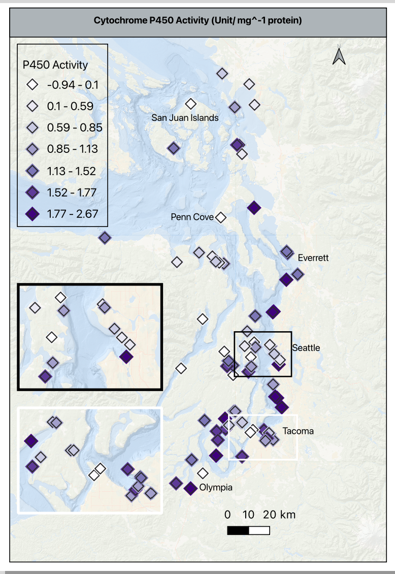
- As a reminder, the contaminants are in ng/g, and p450 is in activity/mg protein
- Using the histogram of values in p450, I moved the default from 30 bins to 7 to clearly visualize the values gradient between -1 to 2.7 without inflating the activity values and remembering that these are the values scaled based on the reference site. A zero means the value is the same at the reference site, and negative number means it is lower than the reference site, and any positive number is higher than the reference.
- The basemap is at 75% opacity to allow the symbols to stand out. The p450 symbol is a 4mm purple diamond with an outline/ stroke of dark grey (#2b2b2b) and a weight of 0.4 and a round join style. This is important because each of these settings, except for the color will be used in the contaminant maps.
- I added a duplicate symbol layer below the one described above to add a bit of depth. It is the same symbol shape, drug below the primary, set to 5.5mm, color is very pale grey (#f7f7f7), opacity at 30%, stoke/ outline off. This halo effect helps makes the higher density sites clearer without an inset.
- Shifting gears a bit, I pulled the summary stats for the contaminant indices, put them in a quick view table, and then thought through how to make consistent groupings, or how to explain the differences in scale.
- None of the contaminant indices will follow a uniform color gradient, so I am trying to group similar scaled classes together rather than group them as I had planned earlier.
- There are three groups that are zero- dominant and 5 groups that have a significant range in concentrations, so I am splitting them into two groups for mapping. Group 1 will go to the supplement as detected/ not detected and group 2 will be in maps alongside the p450 map; the main difference is that the contaminants in group two will be broken down into percentiles of concentrations for consistency and p450 activity will remain scaled to the reference site to prevent inflation or deflation of variability.
- I created the templates for both groups, created the base maps for all 8 indices, and began refining them in the print layout to export. I need to create a single legend that can be displayed for them all, and tweak the details, but the base information and outcomes are complete - finally!
- Putting two maps per print layout
- Width- 139.640
- Height- 205.216
Products & Word Count
STP Presentation Draft: 327 words
Complete Spatial Analysis RMD (excluding header, doc settings & library loads): 487 words
Viz made: 1 map
Today’s total: 814 words
Monthly total to date: 1718 words
Annual total to date: 12,878 words
Tomorrow’s Plan
- Watch the Seahawks win the Super Bowl.